Customize Premiere Pro with Workspaces
By Jim Bask
Most days I find myself in front of Adobe Premiere Pro CC, both by choice and by the jobs I’m booked on. Yes, I know, for some it’s got bugs and flaws, but for me it’s generally well-behaved. Given the choices out there, Premiere Pro feels the most natural to me for an efficient editing workflow.

Part of what makes Premiere Pro work for me is the ability to customize and fine-tune the user interface layout for the way I like to work or the tasks at hand. This is made possible by Adobe’s use of panels for the various tools and windows within the interface. These panels can float or be docked, stacked, or tabbed in a wonderfully large range of configuration possibilities. The Adobe CC applications come with a set of preset workspaces, but these can be customized and augmented as needed. I won’t belabor this post with an in-depth explanation of workspaces, because there are three very good explanations over at PremiereBro.
It all starts with displays
I started my NLE journey with Avid and in the early days, two screens (preferably of a matching size) were essential. Bins on the left with viewers and timeline on the right. However, in the intervening years, screen resolution has greatly increased and developers have made their UIs work on dual and single-screen configurations. Often today, two screens can actually be too much. For example, if you have two side-by-side 27” (or larger) displays, the distance from the far left to the far right is pretty large. This makes your view of the record window quite a bit off-center. To counter-balance this issue, in a number of set-ups, I’ve taken to working with two different sized displays: a centered 27”, plus a smaller 20” display to the left. Sometimes I’ll have a broadcast display to the right. The left and right displays are at an angle, which means that my main working palette – the viewers and timeline – are dead-center on the display in front of me.
I also work with a laptop from time to time, as well as do some jobs in Final Cut Pro X. Generally a laptop is going to be the only available display and FCPX is well-optimized for single-screen operation. As a result, I’ve started to play around with working entirely on a single display – only occasionally using the landscape of the secondary display on my left when really needed. The more I work this way, the more I find that I can work almost entirely on one screen, if that screen offers a decent resolution.
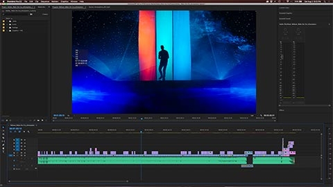
So in order to optimize my workflow, I’ve created a number of custom Premiere Pro workspaces to serve my needs. (Click any of these images to see the enlarged view.)

