Avid Media Composer’s UI Wars
By Adam Noyes
User interfaces
Let’s face it we are obsessed with UI. User interfaces are our way of controlling everything, and I’m not just talking about Avid Media Composer. From the dashboard in your car, the panel on your stove, the buttons in the elevator, the remote in your hand and the apps on your phone, to Google and Facebook, none of us can navigate through five minutes of living our lives without dealing with some sort of an interface.
They all have something in common: someone designed them. Whether artful or ugly, deeply integrated or not, someone took the time to craft every part of every interface we touch. When we find one we love, we want it mimicked everywhere, don’t we? Remember the 1990’s Star Trek LCARS craze? Remember how after the iPhone launched, everything had to look like Jony Ive designed it?
And oh, how we love to be critics of our beloved interfaces. We’ve spent years mentally cataloguing every interface we’ve ever seen with vile hatred or divine reverence. Yet none of us like the same thing. So how the heck can anyone agree? In short, we can’t but that doesn’t stop us. As critics we lash our lists onto everything, from surfing the web to editing in NLE apps to noticing the differences between browsing Netflix on our phones versus Apple TV. Have we grown overcritical? Absolutely. Add to that a global demand for our opinions via services like Facebook and Twitter, and we could easily refer to this era of humankind as “The Age of Criticism”.
And so, to all app designers and engineers everywhere including those at Avid, I say: “Ha! No pressure!”
The Media Composer UI, and the growing user base
“Why are you STILL using Avid? It’s so old! It needs an update!” – Client
We’ve been hearing that for years, right? Well, they’re right. It is old. Name another app you use that was created in the 1980’s. Quicken was made in 1983. So was MS Word. Photoshop arrived a year before Avid, in 1988. Do any of these apps look the same as they did in their early years? Well as the joke goes, Avid did. Even though it has actually gone through about a dozen redesigns since then, the core ideology of Media Composer’s UI has remained relatively unchanged for many years.
But being old isn’t a bad thing when you have a wealth of fresh minds handed a fun, new challenge.
What prompted this more dramatic change in 2019? There were dozens of reasons, but one always bubbled to the top: new users entering the industry were alienated by its interface. Working with video on computers used to be hard. It no longer is. Apps today reflect user needs, and Media Composer’s UI just wasn’t following that curve. I’m not even talking about its comparison to other postproduction apps like Resolve. All apps in general, even mobile, were much farther evolved in the consciousness of the new user base. Media Composer’s UI development just seemed to sit there, like a rusty truck behind a barn.
In defense of most professional editors everywhere, we’d rather have a working version than a pretty one, right? But that was the problem: as professional editors using Avid, our numbers were dwindling.
Media Composer 2019 attempts to put all those issues in the past, and it’s not just because of the look. That would’ve been easy, to just slap yet another UI on top of it. No this is dramatically different. An overhaul of much of the underlying “old code” was also done. The architecture for bins was moved to a whole new framework, and a lot of the generally slow interface responsiveness users saw in the timeline was finally confronted. They really did this one the hard way, and it shows. The timeline’s reactions to clicks, scrolling and other stimulus feels so much faster now.
The initial release of this new interface was on June 20, 2019 with MC2019.6. It was the result of dozens and dozens of top editors and post pros all over the industry being tapped for their expertise as well as their long list of pain points, feature requests and current needs from a UI. The beta testing for this version was the largest in Avid’s three-decade history.
This Avid Blog is a history of Media Composer’s UI that hopefully explains the “why” behind it all. It is about the war that happens publicly and behind closed doors. No, I don’t mean reality TV style brawls between engineers, I mean the creative struggle between three main characters: 1) Avid, 2) Media Composer’s users, and 3) today’s level of computer science and how apps are engineered.
Avid knows there is still a lot of work to be done. There is a massive backlog of features, and many of them were unable to be addressed until this new work was done. With many of the apps old hindrances now gone, much of that work can begin. By Avid Connect and NAB 2020, everyone will begin to realize the scale of it all. For context, let’s bounce around history a bit to see how we got here.
Avid Connect 2019
On April 6, 2019, Avid publicly unveiled the new Media Composer interface to the world at Connect in Las Vegas. Avid’s inventor, Bill Warner himself was in the front row. As long-time Avid moderators, Randall L. Rike and I were honored to be sitting with him.

2019 Unveiling the UI

Chris Bové, Randall L. Rike, Bill Warner
We were shown a brief example of the new interface, which I posted to the Avid Editors of Facebook almost immediately (LINK). I’ve been to many Connects before, but this was the first where the audience was raving over every new part of Media Composer.
Though unlike most of the people in the room, everything being announced was familiar to me. I was approached by Avid a year prior to join a team of consultants that would help steer the development of this new user interface. As you can imagine, here in the audience at Connect I was extremely excited to see all of the work finally being shown.
Later there was a session with Tom Ohanian, who was the eighth employee at Avid in its early days. Tom discussed the UI of the initial Avid/1 Media Composer, and it was fun to see its initial sketches.

Sketch of Avid/1

Kabir Akhtar, ACE, Tom Ohanian
It was a weekend full of nostalgia and forward thinking, a perfect celebration of Avid’s 30-year anniversary.
Flashback: The UI meeting at Avid Connect 2018
Steve Audette, ACE (PBS Frontline) and I were teaching a Documentary Master Class together.

Avid Connect 2018 Documentary Master Class
We were thrilled Avid trusted us with such a large venue during Saturday’s prime lecture time. We were equally humbled to be invited to something much larger the following day.
We got an email from Avid’s David Colantuoni: “We are looking forward to meeting you and hearing your feedback! The Avid Product Management team, Avid Engineering, Marianna and Avid’s President and CEO, Jeff Rosica will also be in attendance.” Within the email were also the words “invite only”. Now really, who could pass THAT up?
It was a private unveiling and brainstorming session of what Media Composer’s new interface could look like.
Entering the room, I noticed the rectangular tables were fitted together into that right-angled horseshoe that is supposed to give some sense of an Arthurian roundtable. People were finding their ways into chairs and awkwardly smiling at each other in that way people do at conferences. We weren’t complete strangers. Pockets of us knew each other quite well. We were simply having fun discovering who else had been invited. Eyes were darting about for nametags on people we didn’t immediately recognize. But again, in that awkward, conference-kind-of-way, we’d soon realize that we were amidst friends and peers we’ve been following online for years.
Steve and I took seats near the center of the horseshoe. Over to my far right were longtime Avid engineers Alan Swartz and Randy Fayan, both of whom I’ve been a huge fan. Next to them were heads of Media Composer, Randy Martens, Kate Ketcham and David Colantuoni. Across from me was the amazing Marianna Montague. The room was filling up with some of the top editors, assistant editors, audio pros and video engineers in the field – Scott Jacobs (MIB: International), Monica Daniel (DC’s Legends of Tomorrow), Lawrence Jordan, Randall Rike, Jonathan Mosier, on and on they filed into the room. The gamut of postproduction was well represented.
The doors closed. The session began. (Was I seriously the only one there who had brought Media Composer to a meeting about Media Composer?)

Brainstorming session for the new UI
The first rule was stressed: no pictures. (Whoops.) The second rule: no holding back. They wanted a true brainstorming session. Screenshots and rough representations of ideas would be presented of what they are working on, and they wanted us to give them a heap of feedback.
And so we did. The meeting lasted two-and-a-half hours.
Randy Martens was introduced. For those who don’t know him, Randy has been around Avid for quite a while. You may remember him from a series of videos on MC6 that came out in 2012.

Randy Martens, 2012

Chris Bové, Randy Martens, Connect 2018
He walked up to the giant projector screen and began his show and tell. We saw a pic of some initial sketches. (Similar to Tom Ohanian’s sketches of the Avid/1.)

Sketches of new UI workspaces
These were a basic draft of what the four primary workspaces – Edit, Color, Effects and Audio – could look like. Although workspaces have been around for years, a lot of Avid editors have simply never used them. So, to some this would be new territory. I’ve been working with them for a long time now, so to me this was simply a better way of making them more front-and-center. I liked this a lot.
We then saw the first concept for the interface.

Proposed new paneled UI
Cool! A snap-to-windows, “paneled” UI.
They demonstrated their initial thoughts, of how each item could move around inside of the panel, and how each might attach. Rather than a magnetic-style attachment, which would merely dock one window to the next like in older Photoshop or Encore apps, these could be made to work within one another, dynamically. It was hard to grasp at first, especially in theory without visuals, so we all just kind of nodded and smiled.
Then they mentioned “floating”. Even though they were going to make it possible for editors to operate in this new paneled UI, they were also going to make it possible NOT to do so. The whole interface could also be “floated”, like it had been for years prior. This was wonderful news.
Decluttering of the screen real estate was stressed. We were shown the idea of vertical tabs. There was a lot of skepticism over this design concept. I mean, they’re odd, right? Reading text at a 90-degree angle? But some of us realized how this design could be used. For example, no more wasted screen real estate in Audio Editing mode. We’d be able to “stack” the tools into one “tabbed tool”. Yes! I’ve wanted that for years. No one ever really needs to see all of the audio tools open at once. It’s not like they need to be watched in real time.

Proposed new UI: vertical tabs and a bin map
Then we were shown a preliminary concept for the “Bin Map”, an idea originally brought forth by Alan Bell, ACE here: (LINK). As the presentation went deeper, craftspeople were raising their hands. Some things they were showing were just not going to work.
Monica Daniel and Scott Jacobs both gave a wealth of praise and thoughtful caution. They explained how some of these ideas might look cool, and might be useful to some industries, but would cause way too many extra clicks or inefficiencies for editors and assistants on long-format scripted series. They wanted to make sure that efficiency and logic should be stressed, as well as design. Steve Audette, ACE and I spoke from the documentary side, making sure that script-based editing and broadcast workflows were addressed. Randy Rike provided perspectives from his experience dealing with users on the Avid forums and his many years as a broadcast engineer.
The folks at Avid were all jotting down notes and responding to the criticism and advice. At times they defended the reasons behind some things, but only to engage more conversation, not to dig-in their heels. It was a wonderful interaction. We all felt like this might be the only time we’d have the opportunity to be heard, so we kept hammering-away with questions.
“Will this be just a facelift?” asked one person. “Will the media engine underneath also be re-coded from scratch to support this?” asked another. Kate Ketcham and Randy Martens went back and forth, answering everything they could. We were quite critical.
Then Jeff Rosica, Avid’s President and CEO entered the room. He put an immediate end to our worries. He didn’t try to shove the old Avid marketing from previous years down our throats of “Avid is listening”. Instead he proved it with action. He explained that Media Composer and ProTools are Avid’s flagship products, and would be ignored no longer. This was going to be a fully funded, fully supported, all-hands-on-deck redesign. The entire backlog of feature requests was going to be looked at. Everything old was on the table. Everything current was on the table. Every idea for the future was on the table. The future of Composer was at stake, and so big development dollars were going to be thrown at this.
It was a silent room, with grins from ear to ear.
After Jeff left, the session continued. Much more was shown, again stressing the recapturing of wasted screen real estate. Here’s an idea we had to gain back the wasted real estate from the Smart Tool, but keep its functionality… What do you think?

A new approach to Smart Tools
Here’s a way we could reconfigure things for “x” workflow. What do you think?
Here’s the idea of bins being changed to allow for [insert many longtime feature requests].
Decluttering of the screen real estate was yet again stressed. On and on it went. They showed many new ideas still being worked on. Randy even showed a few far-reaching interface ideas – new inventions that would not be released until sometime after the initial launch. It was clear they had done their homework, diving deep into the bottomless pit of feature requests.
And then I heard it… A wonderfully familiar voice gently spoke up behind me: “Can I say something?”
Everyone’s heads turned. Norman Hollyn had apparently snuck-in a few minutes late. Norm was a professor at USC, and their endowed chair of editing, which meant he was highly respected both for his views on the history of film editing, but also its future.

Norman Hollyn, Chris Bové, Randall L. Rike
“I just want to say that all of this looks great. When my students compare edit software, not just the interface, Composer is seen as old-fashioned. They are often baffled at how overly complex it can feel, even for simple workflows. So, everything you’re talking about sounds like steps in exactly the right direction.”
Norm always did have a great sense of context.
The conversation steered itself to Media Composer’s performance issues. We all knew the playback engine and the timeline functionality itself was “riddled with old code” that lingered from the original design plans decades earlier. Thus, we were told this couldn’t just be a redesign but a start-from-scratch venture. It had to be. The responsiveness of both the playback and the interface had to be upgraded in unison. (Hence the all-hands-on-deck mentality here.) We were buzzing with excitement, but as we began creeping towards the 3-hour mark we were also getting hungry.
The meeting broke but people hung around chatting for a really long time. Norm and I were in the back corner, discussing this new decluttering and simplified visual approach to workspaces – how the reduced visual strain might even benefit people in the industry with autism & sensory issues.
Sadly, this would be my last in-person conversation with Norm. He would pass away 11 months later, in March of 2019. Looking back, it is heartwarming to know he was part of this group. The loss of his helpfulness and wonderful personality still shakes the world.
As we all walked away from the conference room, my thoughts became playfully lost in a daydream: the memory of seeing my first Avid, over 20 years prior.
A history of Avid’s interfaces

Early test of the Avid/1 in 1987

Bill Warner, Inventor of Avid
The first Avid I had ever laid eyes on was at Jerry Sherlock’s New York Film Academy, above the Trevi Deli in Manhattan (great bagels). Sitting at an early version of Composer was the first “Avid Editor” I had ever met, a brilliant filmmaker named Elizabeth Shub. It was in a back room, past a long row of Steenbeck flatbeds. I remember simply being impressed with the idea of sitting down at a computer to do editing. I mean heck, a computer?

UI from Avid’s early days
Remember, during this time Avid was not usually considered an edit system you created finished videos with. It was simply for offline, and then sending finished edits off to a negative cutter or a linear bay. Back then you didn’t think too deeply about its interface design.

MC7.2 in 1999 (Credit: Oliver Peters)

Avid Symphony in 2002 (Credit: Oliver Peters)
Later in 1999 and 2000, the world was finally editing on Avids in a quality that could be broadcast. I went to Avid training at Sheridan College, Ontario under Didier Kennel. I remember asking him how far I could push the interface design. I wanted to make every single workspace a different color. I wanted to skip Avid’s prescribed color scheme and access the main color picker from the OS itself. I wanted to hop between workspaces and have the entire bin structure change dynamically with my actions. This way I could sit down and instantly see where I needed to go.
We both sat there in front of Media Composer 8 (the first 8, that is), playing and playing, realizing I was asking too much.
Shortly thereafter, I was on a Media Composer 9000XL running MC10. Much better! This tackled a lot of I was hoping for, and it got better for MC11 and MC12. In 2003 the version numbers flipped back to MC 1 when the Avid Adrenaline hardware came out. Then MC2 was released to be the first HD-capable system. Following were versions that kept adding features while maintaining the stunning UI and ecosystem.

The early 2000’s allowed full control of UI colors (Credit: Pianoman72)
All of these offered wonderful control over how the interface looked. The timeline background could be made 0;0;0 black (a very missed feature). Even filler in the timeline could get assigned a user-specified color. (Think for a moment how cool that was, workflow-wise, to temporarily make clips dark and make filler pure white, thus visually identifying holes in a sequence.)
Keep in mind this was before the days where Media Composer was used in any sort of a gray interface, so one could really get creative with everything.

Early 2000’s Interface Settings (Credit: Pianoman72)
Then there was the added beauty of custom Workspaces. (Not “workspaces” as in Avid shared storage, but rather in UI customization.) An entire visual environment could be created for the various “modes” one might use in editing. For me personally, I created a whole color-based ecosystem for my shared projects in a number of facilities. The idea was to be able to walk by an edit system and instantly know what mode it was in. Digitizing was red, audio editing yellow, VFX purple, scripting green, color correction dark gray, and standard editing blue. Timeline settings and Keyboard settings also chased these interfaces.
If I hit a keyboard shortcut for digitizing, it would automatically open the digitize tool, ping the external I/O box, send its signals through the routers, and the interface would turn red, prompting me subconsciously to check my audio mixer to make sure I wouldn’t get feedback once the signals came back from the tape deck and hit the speakers. There were reasons for the other colors as well. The idea wasn’t to define which colors were important; rather to allow each facility to define for itself which colors were important.

Rounded buttons and dark colors in MC2.6.6 (Credit: Kangelis)
The idea of customizing workspaces became vital to many editors. It helped editors recognize occasional “oops” moments. For example, it’s easy to click on the Audio workspace, so some audio work, and then go do some VFX work by simply opening some tools. No big deal, but when they were trying to make VFX edits and suddenly realized visually that the workspace was still set for Audio (yellow), they knew to hit the hotkey to change to VFX mode (purple). This rippled the UI to not only open the correct tools, but also the linked VFX keyboard, timeline views and so on.
The UI was even nice during the DV tape revolution in the early 2000’s with Avid Xpress Pro. This was the consumer-level variation of Media Composer that took off tremendously.

Avid Xpress Pro launch screen

Avid Xpress Pro UI
It was designed a bit differently, with more mouse-driven functionality. When the industry fragmented itself after the release of Final Cut Pro, this was Avid’s answer. For the first time ever, the prosumer and consumer markets were able to get onto an Avid edit system and actually get pro-looking work done and delivered.

Avid Xpress Pro HD (Credit: Lancaster)
Broadcast was a huge buyer of Xpress Pro systems as well, once HDV workflows were incorporated. The market was now being flooded with editors who were not only learning how to cut in the Avid ecosystem with Avid terminology and ideas, but were also able to cater their UI completely around whatever workflows they needed. It was the democratization of Media Composer. Though many high-level Media Composer editors started to look down on this era, it was truly a great time to be creative – at any price point.

Everyone loved the full black timeline background (Credit: Portishead 2007)
If you’d like a full view of interfaces of the past, visit the older photos posted to the Avid Pro Video forums “Avid Customer Setups”.
But in the mid-2000’s, our needs began to change. The need to boost Avid’s underlying technology was becoming more important than its UI.
By now camera makers were neck-deep in the race for file-based workflows, and NLE companies like Avid were chasing their heels. New codecs and wrappers were coming out way too fast. The challenge was to integrate them as quickly as possible, so as not to alienate customers from the media they just finished shooting.
The result began a new chapter for Avid in 2008. They unveiled a new philosophy called “New Thinking”. We weren’t sure whether or not it was hinting towards trouble. We saw that Avid Xpress Pro was going to be EOL, and that all its users were going to be offered a deal to upgrade to Media Composer. Some were worried about seeing some of Xpress Pro’s UI design merging into Media Composer’s.
A sort of a civil war began out of this worry, manifesting in chat rooms and user groups. This time it wasn’t between Avid and users, but between two types of editor personalities arguing over the interface and how people should operate within it. Old school editors who were significantly keyboard-based scoffed louder than ever at the mouse-driven workflows that started with Final Cut and Avid Xpress Pro. Newer editors were much more right-handed, favoring mouse clicks and almost ignoring the keyboard completely. Neither could agree on anything. Yet again, the industry fragmented itself.
Regardless, we still remained in the shadow of these file-based workflows and how to deal with them. With MC3.5, Avid created AMA Linking. It wasn’t perfect but it was enough.
The following year, broadcast editors had a short-lived, but hot and steamy love affair with Media Composer 4. Broadcasting was still largely tape based, and Avid’s new Expert Decompose feature had an ingenious UI and functionality for merging the offline/online tape workflow.
But then in 2010 everything changed. MC5 was released with a new, simpler UI. At first glance we all thought the simpler design was going to be a default setting, and that the functionalities behind the interface would remain intact. Very quickly we realized it was simply stripped-down.

MC5 Timeline
MC5 was a serious upgrade in features, so some editors really appreciated the stripped-down feel. While the previous UI was well-loved, for some users who just need to get in and start working, it could feel heavy and sometimes cluttered. For them, the trivialness of arguing over a UI change was lost in the shadow of getting Windows 7 support, the first implementation of Smart Tools, and the long-awaited RTAS.

MC5 Source/Record Editing
Others hated it beyond measure. I resided firmly in that camp. I was really missing the old UI, and for good reason. Our entire workflow at facilities had to change as a result of the change. Interns and assistants no longer had the color-coding I mentioned earlier, as a means to visually know what mode they were operating in.
With the arrival of MC5.5 and seemingly no changes back towards the earlier UI, there was a social media pile-on of haters. It garnered the nickname “50 shades of Avid gray”.

Timeline UI for MC5 – MC7
Nonetheless we appreciated the features being added. Improvements with MC6 and MC6.5 were a tremendous upgrade in underlying technology: 5.1 audio capabilities and ProTools interoperability, ProRes encoding and so on. MC7 brought more significant under-the-hood advancements, namely FrameFlex, LUT support and background transcoding. Yet again, we the cranky UI lovers accepted the lack of interface in light of these significant workflow enhancements.
MC8 was Media Composer’s volley into the Software as a Service (SaaS) age, and became Avid’s longest-running version number ever, lasting nearly five years. For MC9 Avid instead adopted the year/month system of naming versions – hence MC2018.
And so there we were. It was 2018, and many of us felt we sat on a mountain of reluctant acceptance rather than being immersed in the truly joyful experience of editing. But to be honest, we actually became really efficient with it. We built muscle memory and for the most part, forgot the past. Significant non-interface upgrades of course happened over all these years. Things in Media Composer’s operations certainly got better and better with the times, but we never again saw as much control and flexibility with the interface as the pre-MC5 days.
But then…
The Alpha
It was after 5:00pm on a Friday in December 2018. As I was closing my system down, DING went my email. It was Randy Martens, Senior Product Designer of Media Composer:

“…Try a build of the new UI”? Gee let me think…Yes!
To clarify, there are three phases of testing that Avid extends to non-Avid personnel: Alpha, Beta and Moderator. I’ve been a “mod tester” for years. There are about 50 of us worldwide. Marianna Montague runs the Moderator program, and we get an email from her a few days before a new version gets released. We test it and check the readme files.
Alpha/Beta is very different. When you sign up, you are asked how many honest hours per week you can dedicate. So being “on Beta” isn’t simply early access to the software. A responsibility exists to engage with it and then report opinions and issues.
I was thrilled to have been asked, but I could see a catch. Avid’s engineers and app designers are intensely dedicated. In order to become a reliable source of feedback for them, I would have to say “no” to a lot of my usual freelance work for a couple of months. I would have been sorely disappointed in myself to be asked to help, and then get pulled away by clients. Luckily it only ended up being three freelance jobs, an estimated loss of about $12,000 USD. Was it worth it? I didn’t know yet. I mean, well, what if this new Media Composer really sucked?
The process of testing Alpha was a blast, partially because of the direct conversations I was having with the designers themselves but partially because I got to watch design elements get better and better. Watching the UI get worked on over the course of a number of versions was a real education.
Of this, I kept a journal. Here are a few fun excerpts:
MC Alpha Journal – Day One (17 December, 2018)
Wow this is weird. I’ve never worked in an “alpha” version of the software before. There are areas of the app that just don’t work. This is SO ODD… but fun. Lots of areas are still being worked on.
MC Alpha Version 3 Journal Entry (26 January, 2019)
This is still a very unstructured version. Dual monitor doesn’t work, and won’t for a while I’m told. But I have a bigger problem – I simply cannot get used to Media Composer without the project window. This totally sucks. [UPDATE: Randy says each bin is going to have access to a “bin container side bar square” that will make it act like the Project Window.] Interesting. I like that idea. Then each bin, anywhere on my screens could potentially be the project window. Nice.
Note: The responsiveness is amazing. I love how this feels. Clicking on things in the timeline is so fast – much faster than previously. They obviously re-architectured a lot of the underlying code already.
Seeing an issue with the paneled UI. There is extra black around the video frame. I can’t decipher the difference between this nothingness and any legit letterboxing in the video itself. A workaround for it could be to make the Grid Safe Action 100%. I’ll suggest it to the group.

Grid Safe Action set to 100% helps identify the video’s edges
MC Alpha Version 4 Journal Entry (11 February, 2019)
Wow they sure released this update quickly. I see they incorporated many of our suggestions. But now I can’t read any of the timeline text when I highlight in/out points. They said they’re still working on font colors and contrasts though. Will advise them.
Loving how I can use the OS color picker to change how I color-code things. However, regarding the skinning and the highlighting, the whole timeline – when the Light Mode is active – is too gray.

An early Alpha version: gray shades in UI are too subtle
Need to suggest bringing back a colored highlight. The only highlight color is a light gray, which is too hard to discern. I have in/out points highlighted here, but I can’t see them at all.
The Beta
On March 12th, the program transitioned from Alpha to Beta. This means we’re now looking at each version of the beta app as a full app, not in portions. Wohoo!

MC Beta Version 6 Journal Entry
Whoa, this version threw a goofy font on everything – probably just an installation issue. Will let the team know.
Highlight of the in/out in the timeline still needs work. It’s almost inverted currently – the clips are colorful but the highlight is a grayish white. The colors of things in the timeline are still conflicting a bit, and there are situations where I cannot see the highlight at all. I sure do wish there was a highlight color.

An early Beta version: source-side play area too dark to see black markers
Brightness issues: Some interface text is white, and some is black. Occasionally, I can’t read the text or see Markers because of how dark the area under the S/R monitors is.
MC Beta Version 10 Journal Entry (23 May, 2019)
Yes!!! They fixed the timeline colors and fonts, and they’ve added a purple highlight. This works for now. I’d love to see more highlight colors eventually but let’s move onto more vital stuff. Also, they announced a delay in the public release. Basically, they want to give this release more time to get the launch in to the best state it can be. Great idea.
Playing around between light and dark modes. Also playing with the Smart Tool’s replacement concept. Hmmm… I’m really gonna need to train myself on this one. The concept is tricky to master.

Getting used to the new Smart Tools interface
MC Beta Version 12 Journal Entry (6 June, 2019)
I can now hop nicely between light and dark interfaces without seeing any visual problems. All of the color and font issues seem gone. I can’t believe how much they’ve fixed so quickly! There are just a couple more potential bugs to discuss.
The Public Release
A few days before the public release, a final email came from Keith Gerrard, the leader of the Avid Beta team. “This has easily been the longest beta program that we’ve run here, and we could not have gotten Media Composer to this point without YOUR help!”
There was, as you can imagine, a general sense of both excitement and worry. The love of any UI experience really does reside in the individual personality and style of the user, which is impossible to forecast. There’s a strong chance someone would dislike it simply because they have a fondness for green highlights over purple ones. But at a certain point, Avid just has to stop designing and let the public decide.
And there was a nice surprise bonus. Just as the launch was happening, Avid made public a huge number of tutorials for this version.
When June 20th hit and both 2018.12.6 (old UI) and 2019.6 (new UI) were released, I watched everyone’s reactions to them on the Avid Editors of Facebook. Here are some fun quotes:
Am testing Avid 2019.6 and liking how snappy the interface is so far.
It’s the same Avid, with significant but good interface updates.
2019 up and running on the home system. Don’t think it will take long to familiarise myself with the new layout. The workspace tabs are a nice addition. Docked panels work wonders for my OCD! Cheers!
Is this really the only colour choices we have for the tracks? Makes my eyes hurt!
Anyone else having a hard time getting smart tools back into their UI of 2019.6?
If I install the new MC am I able to reinstall an older version? Or am I stuck with the newer one?
First impression is not great for me – feels like its dumbed down – hopefully will settle into it!
I’m a big fan of the new UI. Has a lovely modern feel to it. It’s responsive, intuitive and will really help me organise my footage better than ever before.
So resizing and docking windows is cool and all, but it would be even more cool if the color correction controls actually scaled with the window.
Been training on 2019.6 most of the day. getting the hang of the new GUI and loving it.
Today I had my first client supervised session with 2019.6, and it was great. Not one hiccup or crash.
Oof, I really don’t like the windows all docked together. I’m gonna have to find a way to work around that.
Sorry to be negative, but I liked the old interface better. It is kind of exhausting trying to find things now.
I like the new 2019.6 interface. There seems to be a lot more room, and I like the Host Window choice for individual screens.
The differences between versions 2018 and 2019
You do have a choice whether to try the new interface. If not, you can keep accessing 2018. My personal suggestion if you’re leery of the massive change: Have your current version’s installer file sitting on a drive somewhere, and then go back-and-forth between them until you’re comfortable with the new interface.
There is a difference development-wise. The newest features will only be added to the 2019+ versions. Now don’t get snippy about that. It would take entirely too many resources to try to apply the exact same new features to what are essentially to differently coded apps. So, for your own learning process, it is up to you to decide whether you actually NEED the new features or if keeping your comfortable, stable version is better for working with clients. Remember, some of the top television shows today are still being made on older versions with dongles.
2018.12.x series
In December of 2018, Avid released this version. They have been updating it with patches (Windows) or updated versions (macOS) ever since. This is going to be updated and current for a while. For Apple users, know that it is qualified to run starting on Mojave 10.14.5. *It is not qualified to run on any other version of Mojave. So, to eliminate all possible issues that Avid’s engineers didn’t test, you should update your macOS to 10.14.5 immediately. For more info on macOS versions, go to Avid’s Version Matrix: or to my little cheater website:
Positives: It is the most recent version you can have that completely ignores the idea of a new user interface. For many users with no time to learn the new interface, and for facilities with older computers that might not be qualified to run the new interface, this is a great way to stay current.
Negatives: Since the new interface was also retooled on top of a lot of new code and architecture upgrades, the timeline and functionality of this version will not be as snappy as 2019. Also, it hasn’t been discussed yet but everything in the world of computing eventually gets an EOL date. One could safely imagine that the old UI would be retired before the new one.
2019.x series
This is also going to be constantly updated and current, just like 2018.12.6. For Apple users, know that it is also qualified to run starting on Mojave 10.14.5. *It is not qualified to run on any macOS before that. So, to eliminate all possible issues that Avid’s engineers didn’t test, you should update your macOS to 10.14.5 immediately.
Positives: The latest and the greatest. The new interface. The fastest “feeling” version out there. Plus, LOTS of new features. Many more than the 2018 and prior builds.
Negatives: Whether you’re talking about NLEs or not, bugs are in all new software, everywhere. However Avid is fast to fix them. A month later, Avid released 2019.7 which included 50 bug fixes.
I find the new interface to be a great 1st phase towards a perfect UI. It’s not there yet but gosh, the bulk of the work that needed to be done in order to get it to this point was staggering. Now with that out of the way, I can’t wait to see what’s next.
In the meantime, here’s what we DO have right now.
1) Four default workspaces, significantly coded for efficiency and snappy interface behavior. The ability to create custom workspaces in addition to these is also great.

The new default Workspace Bar is awesome
2) The redesign of the icons is terrific.
3) The ability to fully color-code the interface is back to about 80% of what it was. This puts us into a really good place for a while, as more important functionality gets built into the app. The next step would be to gauge whether a full return to the pro-MC5 Interface Settings is in order, or if new UI tools can allow for something even more robust. I’m guessing the later would make the most logical sense.
Don’t forget that the clips themselves in the bin can be re-colored to anything you want, via the OS color picker. You don’t have to use Avid’s default colors. Here is an image I doctored to show two possible scenarios – one with the Default Timeline tracks enabled, and one without. As you can imagine with showing the Timeline’s clip colors as Source, and then using the OS color picker to designate clips whatever color you wish, it is possible to create a nearly black-and-white environment.

An example of how much the UI colors can be changed
Below is a screenshot from Steve Audette, ACE, who has not only adopted the paneled UI, but has gone with a very desaturated look. So, for everyone who hated the initial promotional images of MC2019, here’s your proof that you really do have a great deal of control over the UI.

Timeline Tuesday from Steve Audette, ACE
That being said, please don’t discount the track colors. Not yet. Get in there and play around with them. You will discover a lot of new flexibility in how things can be organized in your edit.
4) The paneled UI was the hardest thing for me to learn. I loved the magnetic elements and window panes in other apps I’ve seen like Adobe Encore, and so to see one that didn’t behave the way I immediately expected it to took a longer learning curve than I thought. Let me rephrase – the understanding of it came quick, but building that understanding into a muscle memory that I could use with clients in the room took a few weeks. I’ve grown to really like a hybrid version – where I have my left monitor paneled with all my bins, and my right monitor floating with the S/R window, Timeline and Audio Tool. Now that I’m used to it, I can’t go back to 2018 or prior. I like this too much.
5) The Bin Map is just cool. Note: This is just the initial look of it. As users give more feedback to how they are using it, it will be tweaked a bit more visually.
And finally: Why is creating a thoughtful UI even important?
Let’s play devil’s advocate. Why is it important to create a UI with the assistance of users anyway? Why allow users to care about colors, design and layout at all?
Simple answer: comfort = focus.
Authors and novelists seek out that special typewriter or perfect chair with a laptop, or whatever comfortable environment in order to focus on the content they’re writing. For Avid editors, their comfortable environment actually is the Media Composer UI. This is where they eat and sleep. This is where greatness takes root. I’ve known plenty of top editors who would rather wrestle with technology than wrestle with the interface.
In order to be creative, we first need to be comfortable. Since we’ve established that no editor likes the same things, it is only logical to conclude that we need to be able to craft our own environments – our own little corners of the universe.
We need the UI to offer as many robust options for customization as possible. That’s why this new interface has so much promise: a much stronger ability to organize using colors and workspaces, and the ability to choose between a paneled UI, a floating one, or even a hybrid.
I’m reminded of that brilliant scene in The Right Stuff where the astronauts are arguing with the engineers over whether the capsule should have a hatch with a window. The same thing applies to all app design and engineering. While editing is of course about creating the finished product, editors are stuck in small capsules of their own with nothing in front of them except their edit system, day after day for their entire careers. They probably don’t have a Master’s degree in computer science or even know the differences between design and engineering, but they do have a sharp wisdom of everything that affects the needs and efficiencies of their day.
If there’s a technical limitation forbidding something in an app from happening, that’s fine. If putting a window in the spacecraft resulted in the astronauts burning up upon reentry, then eliminate the window. The point is to try. The point is to find that perfect half way point, where engineering + the user experience + Avid’s ability to fund it all perfectly meet.

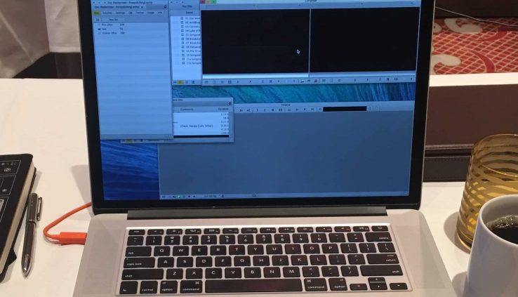
Two-hour documentary, finished on MC2019.6 (Credit: Chris Bové)
Which brings us back around to the new Media Composer. Do you have opinions yet?
Do you like it? Do you hate it? To be honest, I really don’t care. Not yet. I will soon, I promise… but not yet. Not until you’ve operated it on a paid, professional job for a minimum of 40 hours. I’m serious about that. Spend a full week inside of it, under excruciating pressures of time and money. Have your previous version ready to be reinstalled if it gets too impossible to operate, but honestly try to muscle through the new version.
Our minds operate differently when we’re under pressure. We forget about being armchair critics and we become adapters. Our seldom-tapped adaptability traits wake up and take charge. In martial arts, they say you’re not allowed to dislike a move or a technique that you’ve just learned; not until you’ve done it 1,000 times. Only then are you qualified to have an opinion because by then it’s been absorbed into your consciousness. (And if you’re into martial arts, you know doing something 1,000 times is really nothing.) Same concept applies here. It’s easy to dislike a car for the paint job, but love it once you’ve given it a thorough test drive.
So, when you’re ready to look into the new Media Composer, give it more than just “a college try”. Dive into it and do things over and over until they sink in.
Editing is one of the most fun jobs ever, and this new version allows you to decide how to have that fun. You’re no longer locked into just one way of working. Speaking of which… Get back to work!